UX/UI Visuals
Little Bipsy Shop App
A year long UI and UX optimization initiative focused on improving structural clarity, visual storytelling, and measurable engagement within the Shop App Storefront.
Shop App UI
Optimization
Architecture
Storytelling
Analytics
2025-2026
Year
Scope
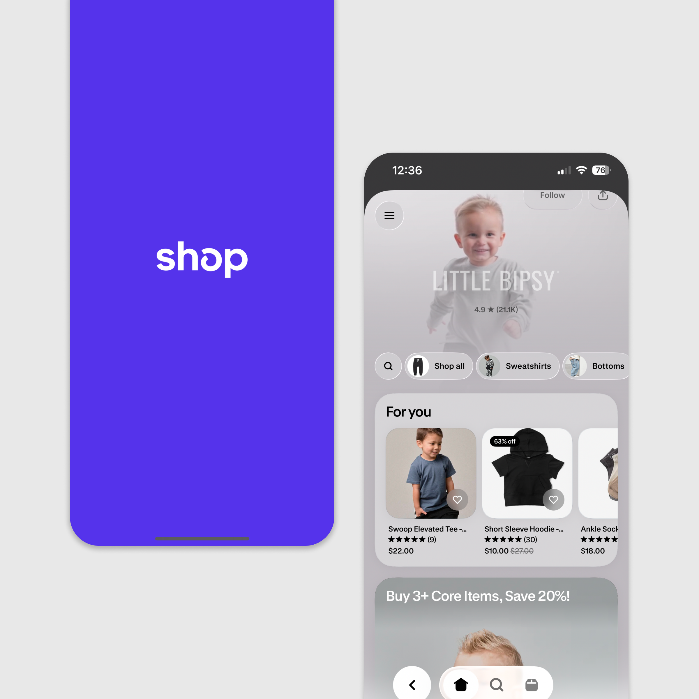
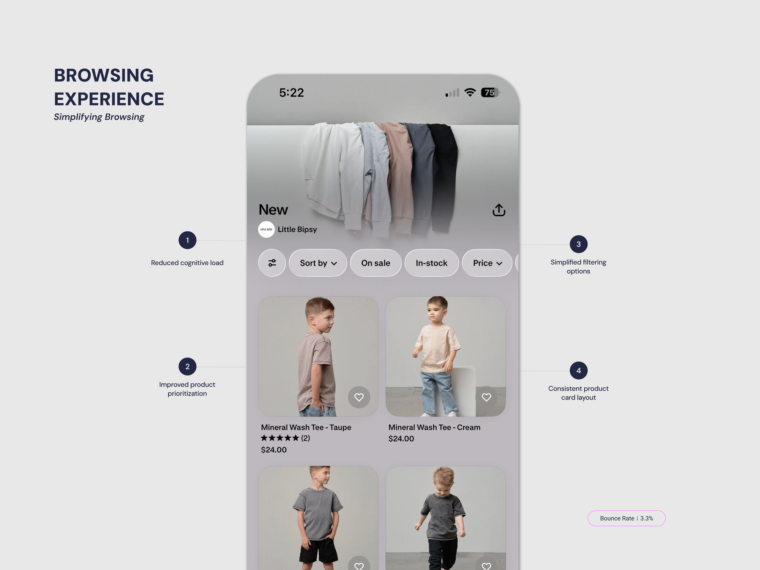
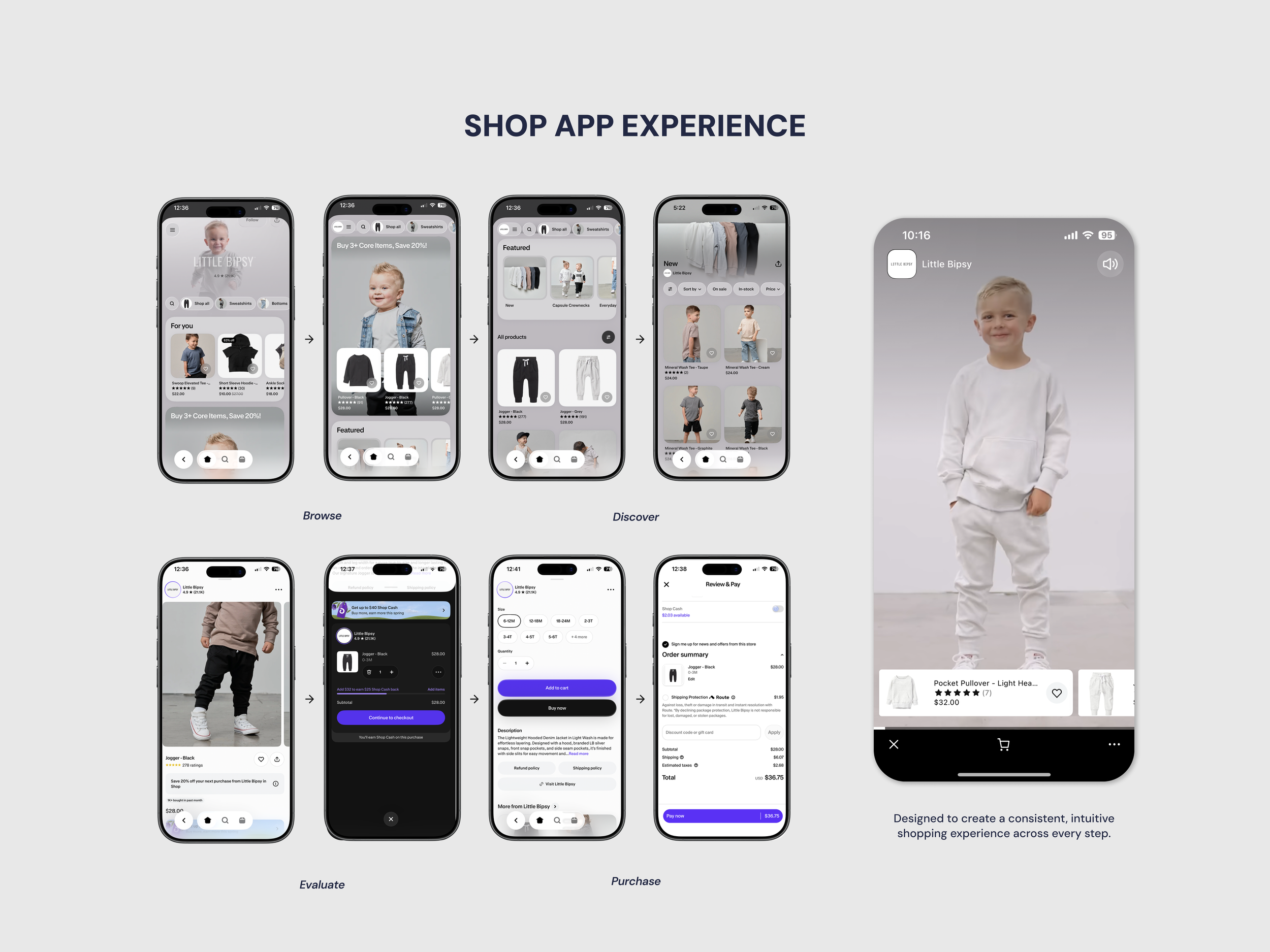
This case study documents the year-long UI and UX evolution of the Little Bipsy Shop App. Through homepage optimization, navigation refinement, and strategic visual updates, the storefront was transformed into a more structured, cohesive, and performance-driven experience.
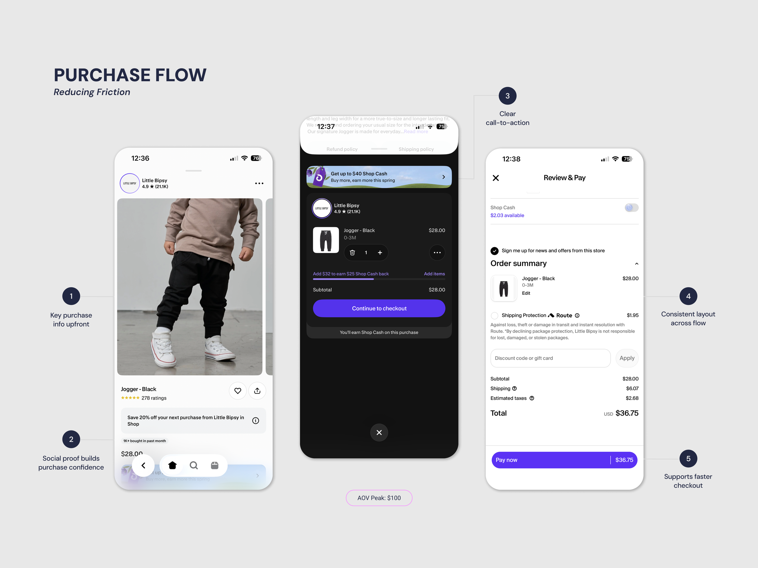
The goal was to create a consistent experience while reducing friction. This would allow users to browse intuitively and move toward purchase in fewer steps. These improvements were continuously refined and evaluated against performance metrics to understand their impact on user behavior.
🎯 My Role
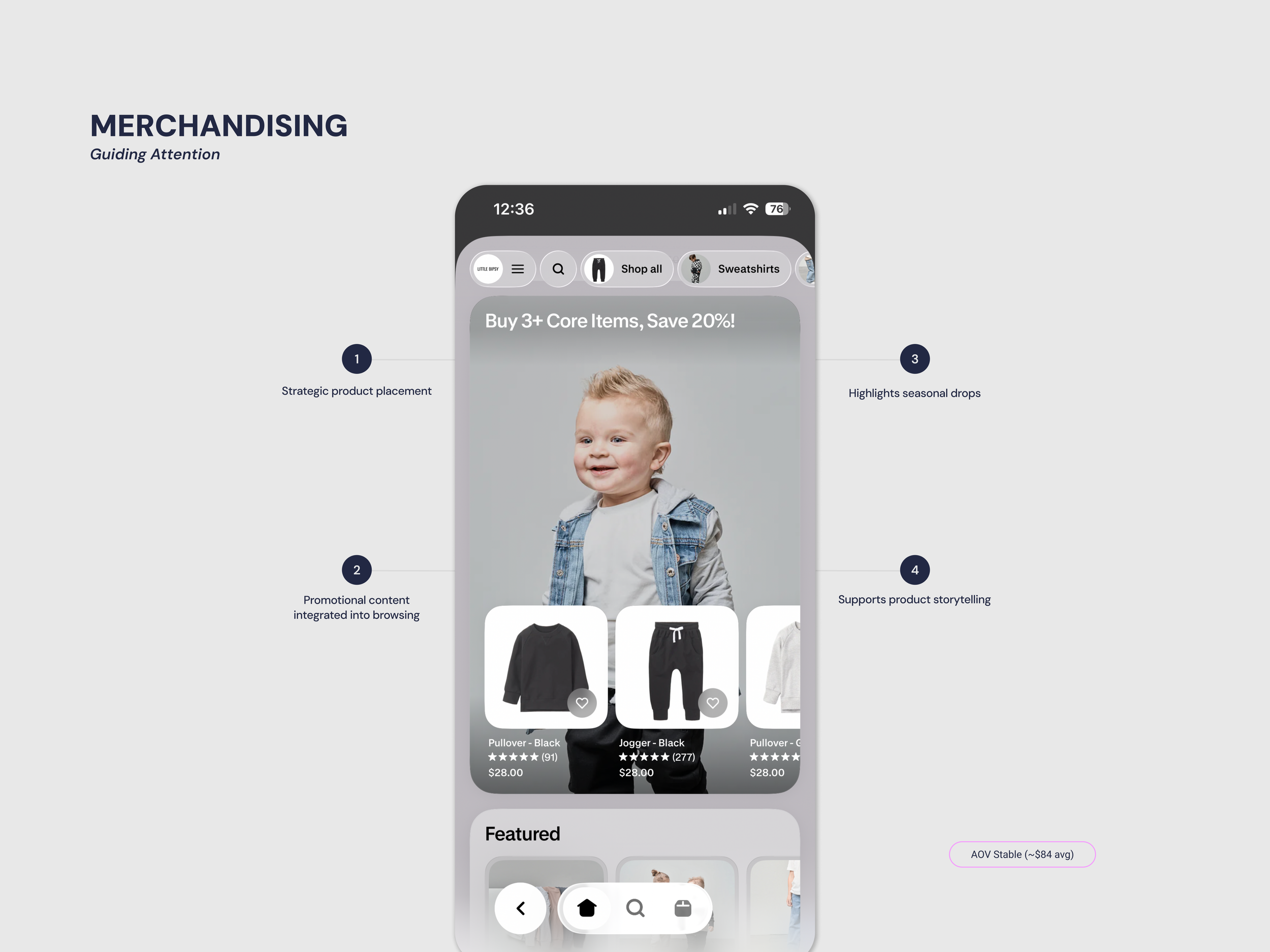
In-app merchandising
Collection creation & restructuring
Product prioritization
UX optimization within constraints
Ongoing analysis of performance metrics
⚠️ Constraints
While the core app UI is native to the Shopify Shop App, I optimized the storefront experience through product curation, collection structure, and visual hierarchy to improve usability and conversion.
-
![]()
Track Analytics
Identified trends and opportunities for improvement.
-
![]()
Maintain Brand Consistency
Kept the app visually aligned with the brand.
-
![]()
Test & Iterate UX
Monitored analytics and tested changes to improve the experience.


The Approach
Align & Simplify
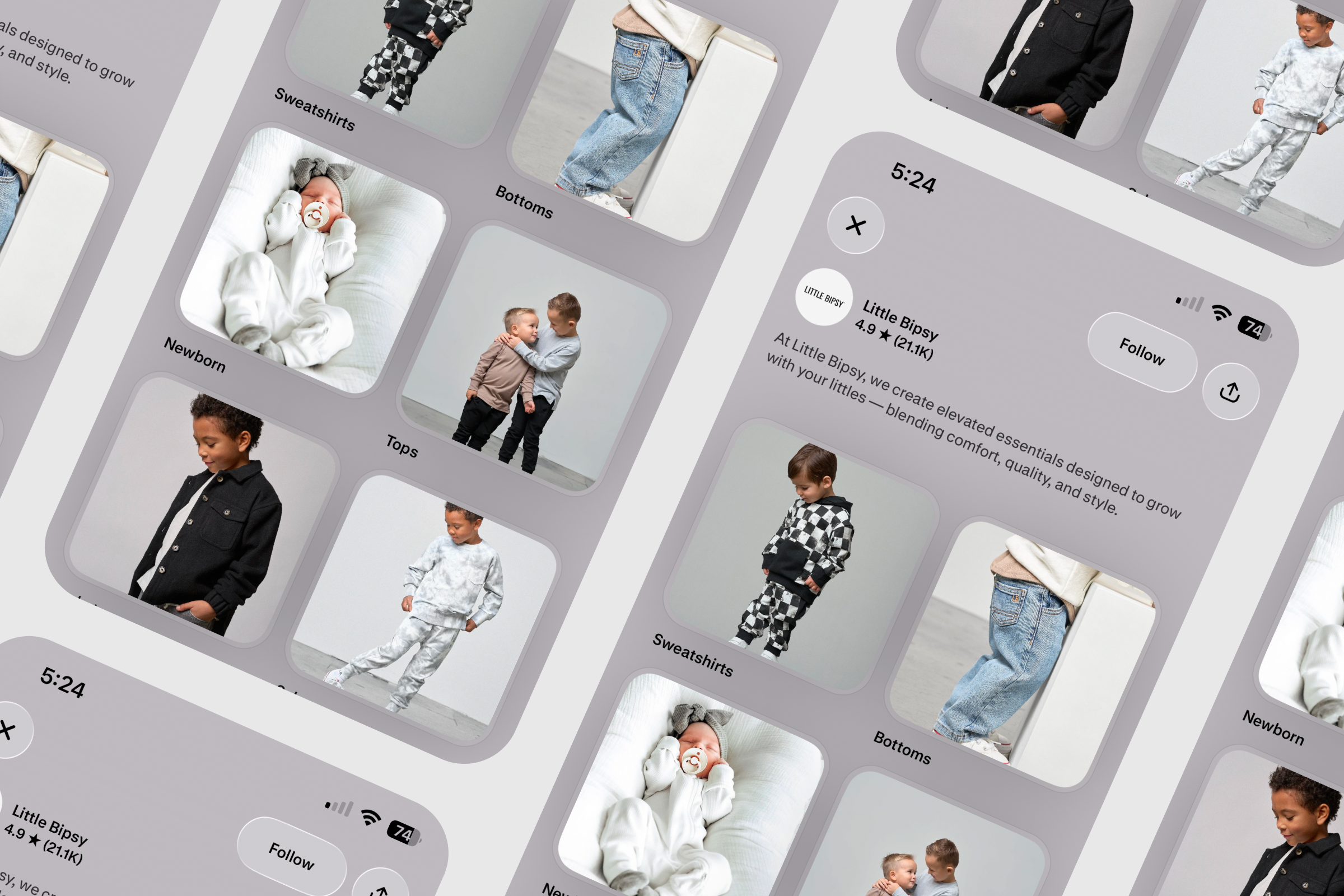
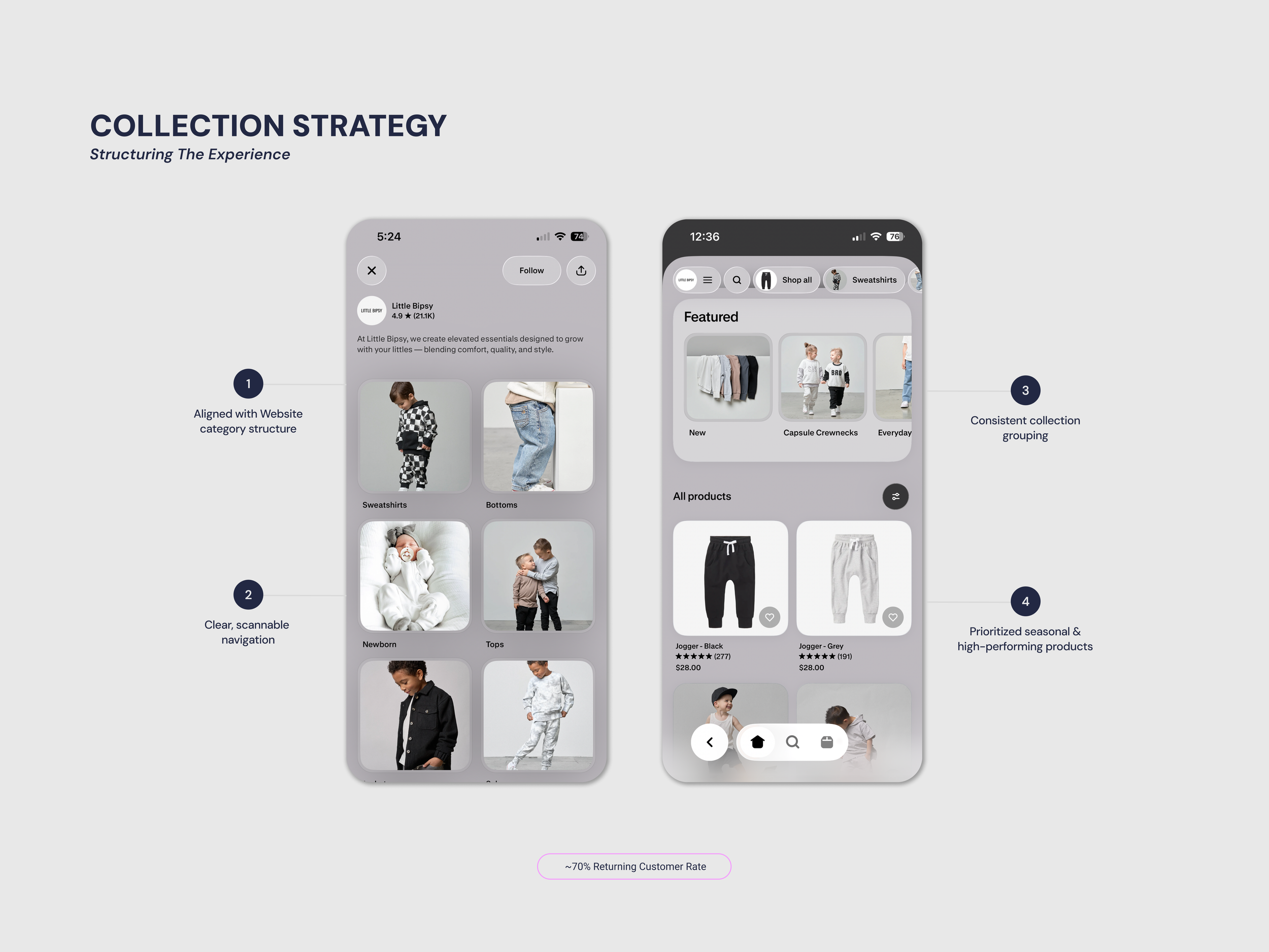
Rather than redesigning the interface, I focused on influencing user behavior through strategic merchandising and structural alignment with the website.
Collections, product groupings, and visual hierarchy were intentionally designed to feel familiar across platforms while simplifying the path to purchase.
Impact
Improvements
Design and merchandising updates consistently correlated with improved engagement and a more efficient shopping experience within the Shop App.
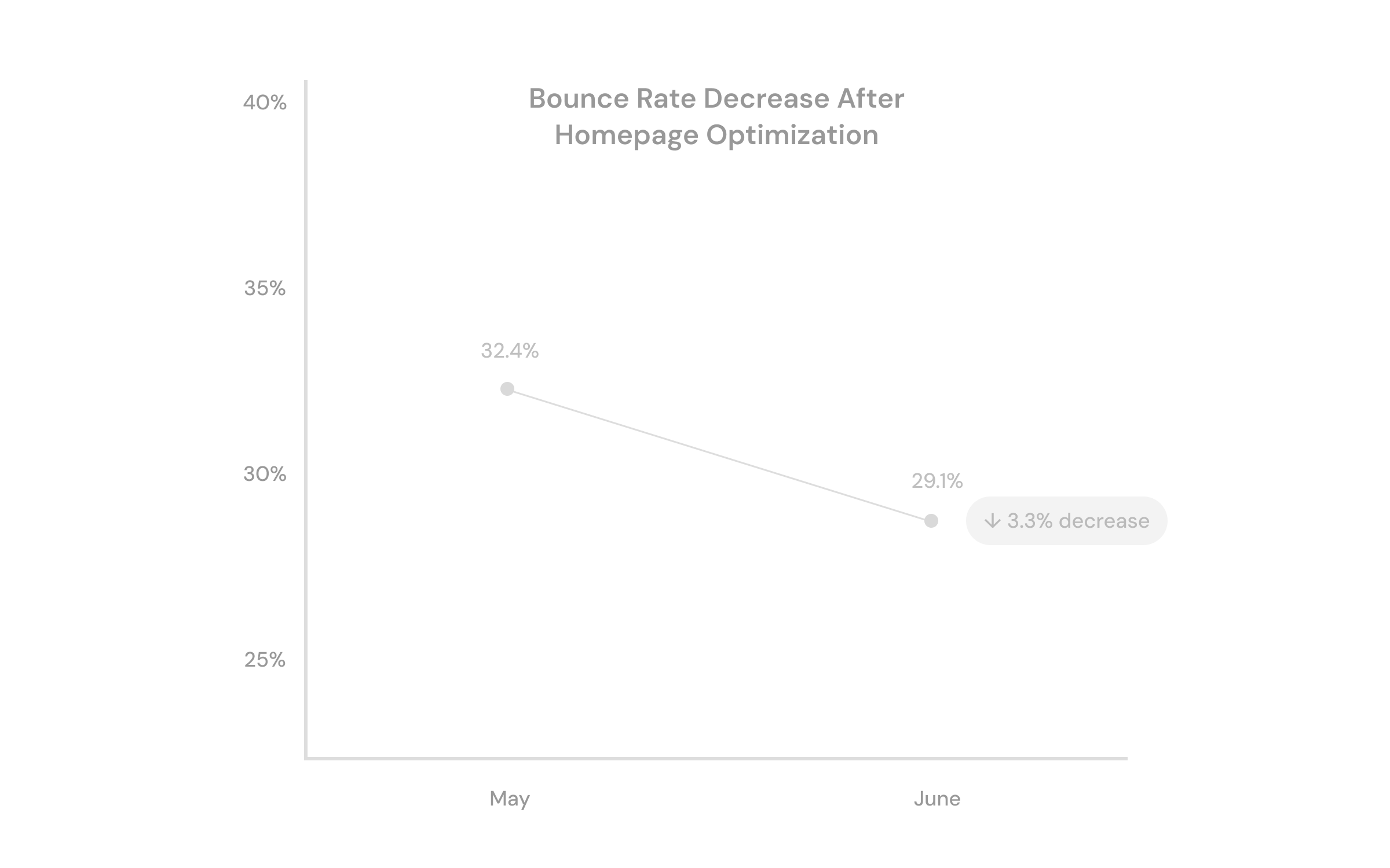
UI Bounce rate decreased from 32.4% → 29.1% following homepage optimization
Returning customer rate remained high (~70%+), indicating strong usability and consistency
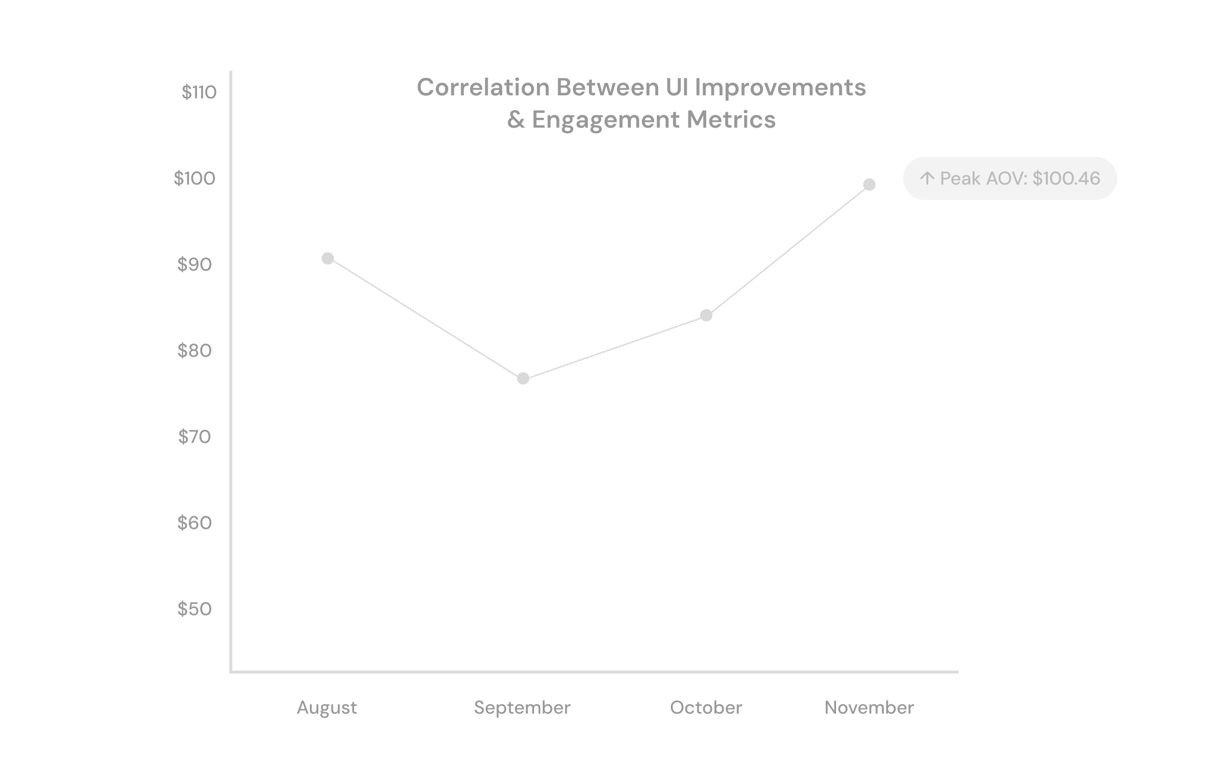
Average order value remained stable, peaking at $100.46 during seasonal merchandising updates
Design Insights
Overview
Ongoing UI refinements created a more cohesive and engaging experience, contributing to increased engagement, stable AOV, and stronger customer retention.
Refined UI reduced bounce rate
Increased returning customer rate
Stronger visual storytelling across the app
Increased overall traffic
Strong holiday sales performance
Conclusion
The Shop App optimization focused on creating a consistent and intuitive experience across every stage of the shopping journey. By aligning navigation, simplifying browsing, and reducing friction in the purchase flow, the result is a more seamless path from discovery to purchase.
These improvements aligned with measurable shifts in user behavior, including a decrease in bounce rate and sustained engagement, reinforcing the impact of a more structured and user centered experience.
Looking Ahead
Moving forward, I would focus on expanding cross-channel strategies to drive Shop App adoption and engagement. This includes integrating app focused messaging into email marketing, building targeted flows to guide users into the app experience, and testing incentive based promotions; such as app exclusive discounts to increase conversion and usage.
These efforts would help create a more cohesive connection between marketing and product, supporting a stronger end to end customer experience.